Empathy Docs - Redefining Developer Documentation
Role
Product Designer
Tools
Figma, Sketch, Zeplin, Miro, Jira
Skills
UX/UI Design, Visual design, Prototyping, UX Research

Project summary
01
The problem
Documentation was fragmented across multiple sources (Confluence, Google Docs, internal tools), making it hard to find, inconsistent, and ineffective as a self-service resource.
02
The goal
Centralize all content into a single source of truth and turn it into a clear, scalable product that improves onboarding and reduces support dependency.
03
My role
Led the end-to-end redesign of the documentation experience, covering information architecture and navigation; participated in research and collaborated closely with engineering and content teams, defining a scalable design foundation.
04
Impact
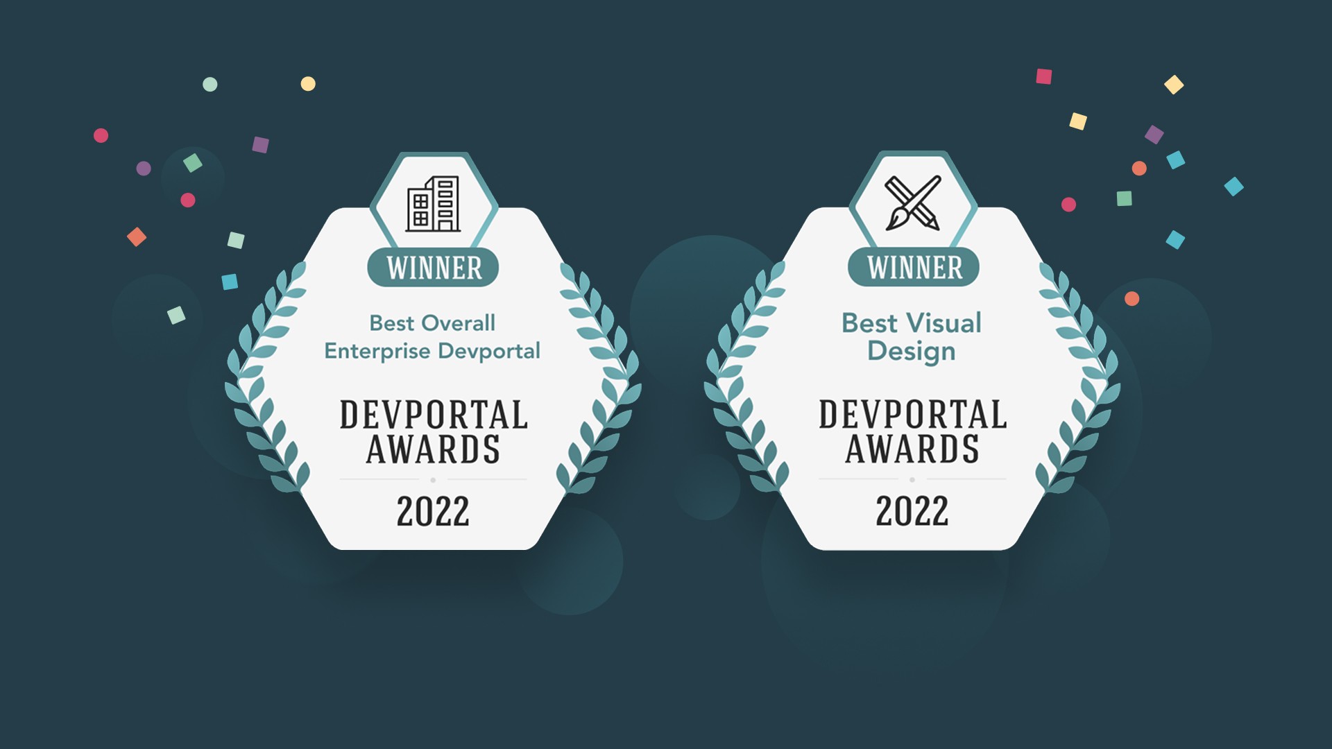
Reduced support dependency by lowering ticket volume, improved user autonomy, and established the documentation as a scalable, self-service product, recognized at the DevPortal Awards.
Context
Empathy Platform Docs is the documentation portal for Empathy.co, one of the leading companies in Europe specialized in search and discovery experiences for e-commerce of brands like Inditex, Mango, Kroger, Carrefour, Tous, Primor and Druni, among others. The mission of the Documentation portal is to bring technical knowledge closer to users (developers, merchandisers and partners) in a clear, accessible, and visually engaging way.
Taking over the design
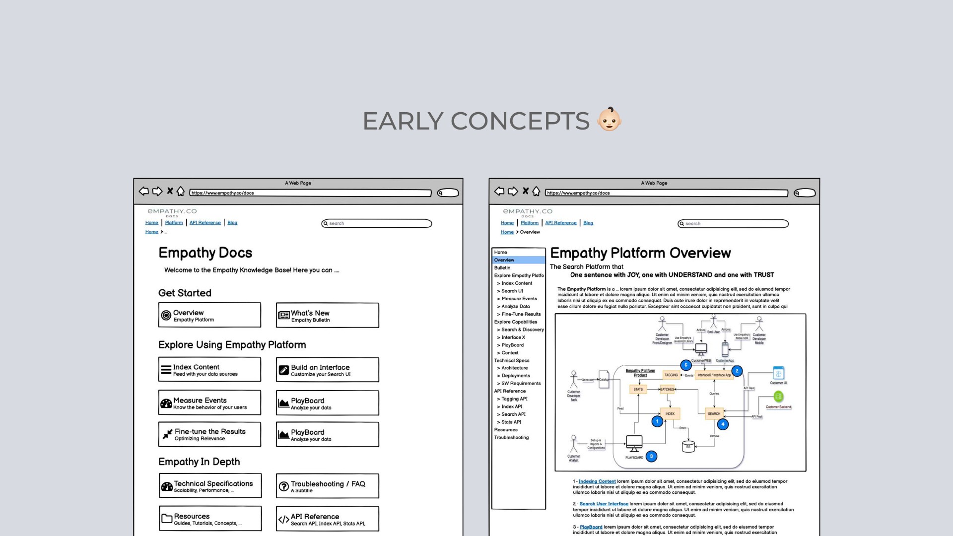
Before the redesign, the portal functioned mostly as a static repository. Content was hard to scan, navigation was inconsistent, and support teams were still answering repetitive questions that documentation should have resolved. Initial wireframes from the Product Owner provided a first structural draft. These concepts helped frame the starting point, but after research and defining the information architecture, many of these ideas were refined or replaced to align with user behaviours and documentation requirements.
Challenge
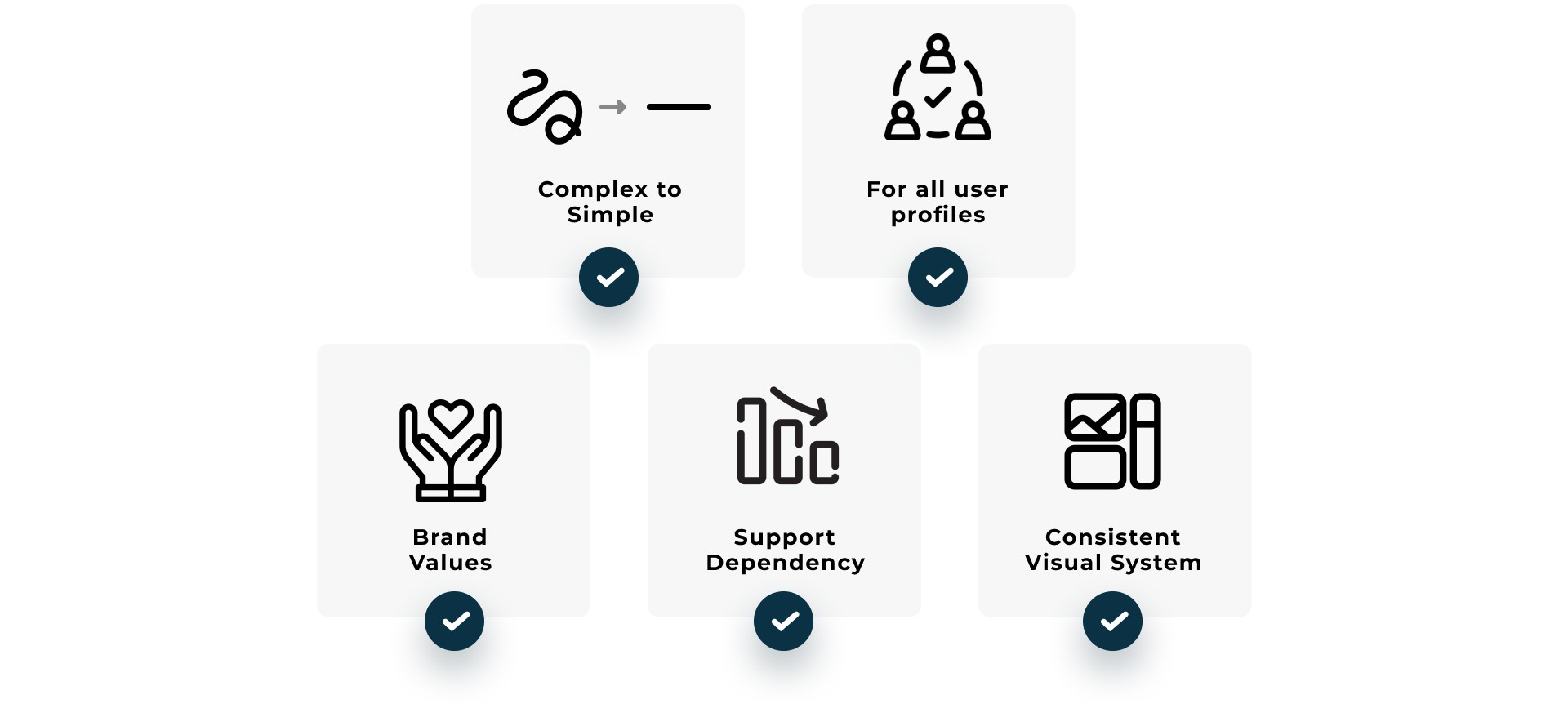
The main challenge was transforming a complex technical repository into a self-service, user-friendly, and intuitive experience where any user (from developers to merchandisers) could find answers quickly, reducing the support load and improving the onboarding experience for our clients. Additionally:
Simplify complexity and centralize knowledge so users could find answers effortlessly.
Make the documentation usable for the different user profiles.
Reflect Empathy’s core brand values: Trust, Understanding and Joy.
Reduce support dependency by enabling a more autonomous user experience.
Establish a modern, accessible, and consistent visual design system aligned with the product ecosystem.
My Role as Product Designer
UX Strategy & Research
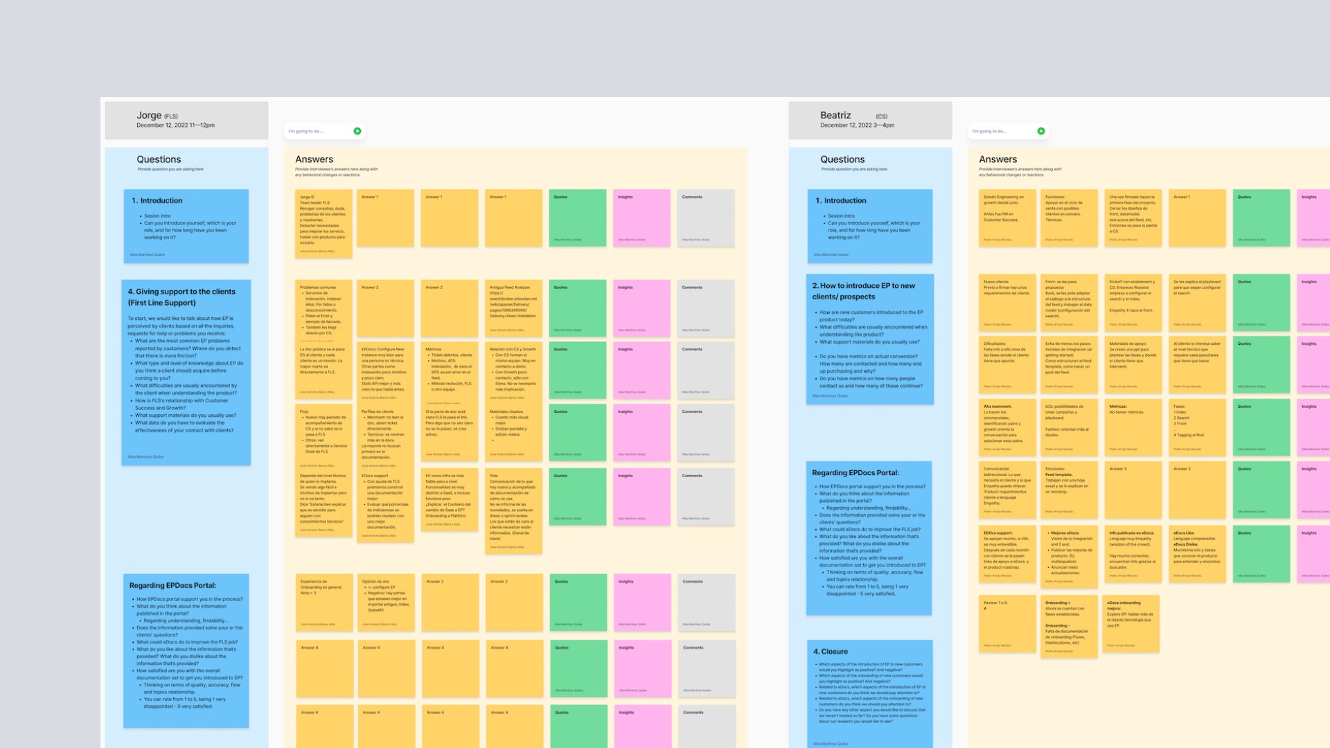
I collaborated closely with our UX Researcher to run a full discovery process aimed at understanding our users more deeply and validating a set of initial hypotheses based on early feedback and known pain points.
We conducted 6–8 interviews with internal teams (Customer Access, documentation stakeholders, platform developers) and external users such as merchandisers and client-side technical teams. My role included preparing interview criteria, running sessions, capturing raw feedback and later synthesising it into actionable insights.
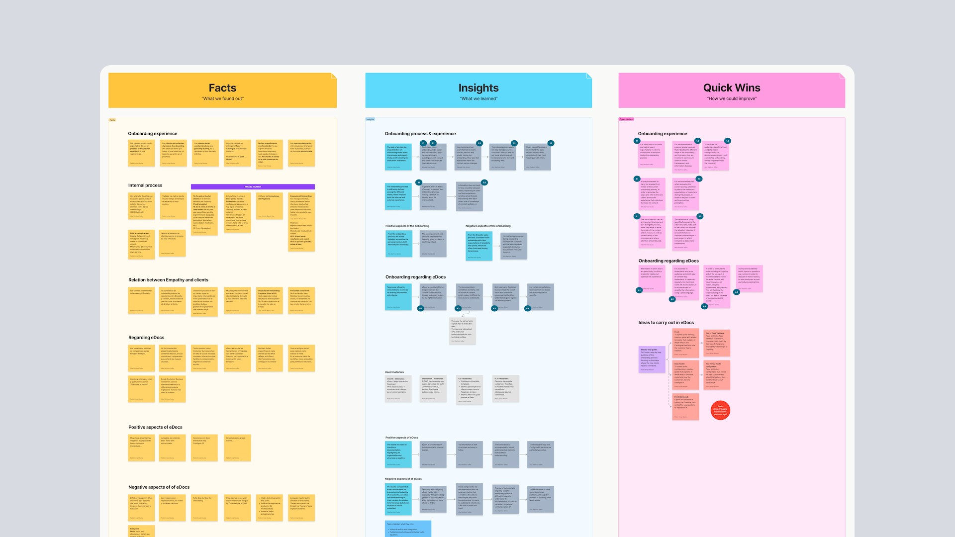
I helped cluster responses, detect recurring behaviour patterns and define the key findings that shaped the redesign, specifically around discoverability issues, unclear onboarding paths and information density.
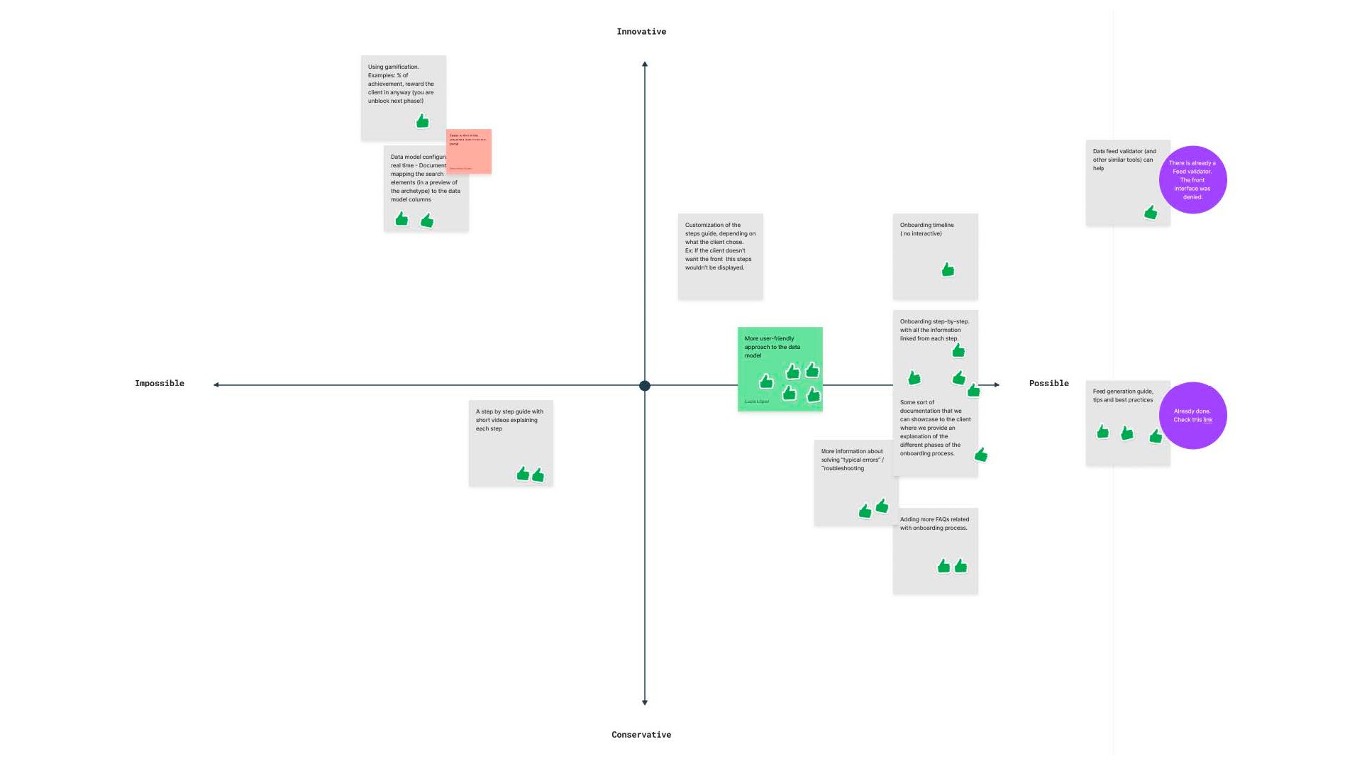
Beyond interviews, I took part in co-creation workshops and user journey sessions, working with card-sorting methods and an impact-vs-effort matrix to prioritise improvements strategically.
These research outcomes served as the foundation for the new IA and experience design of the portal.
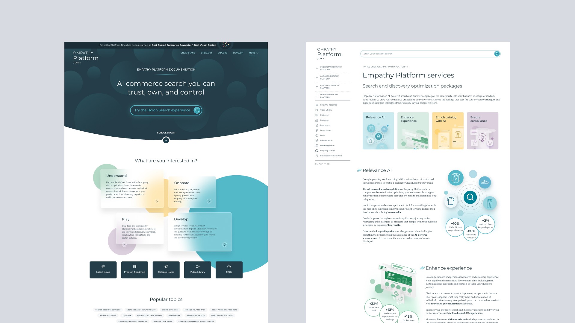
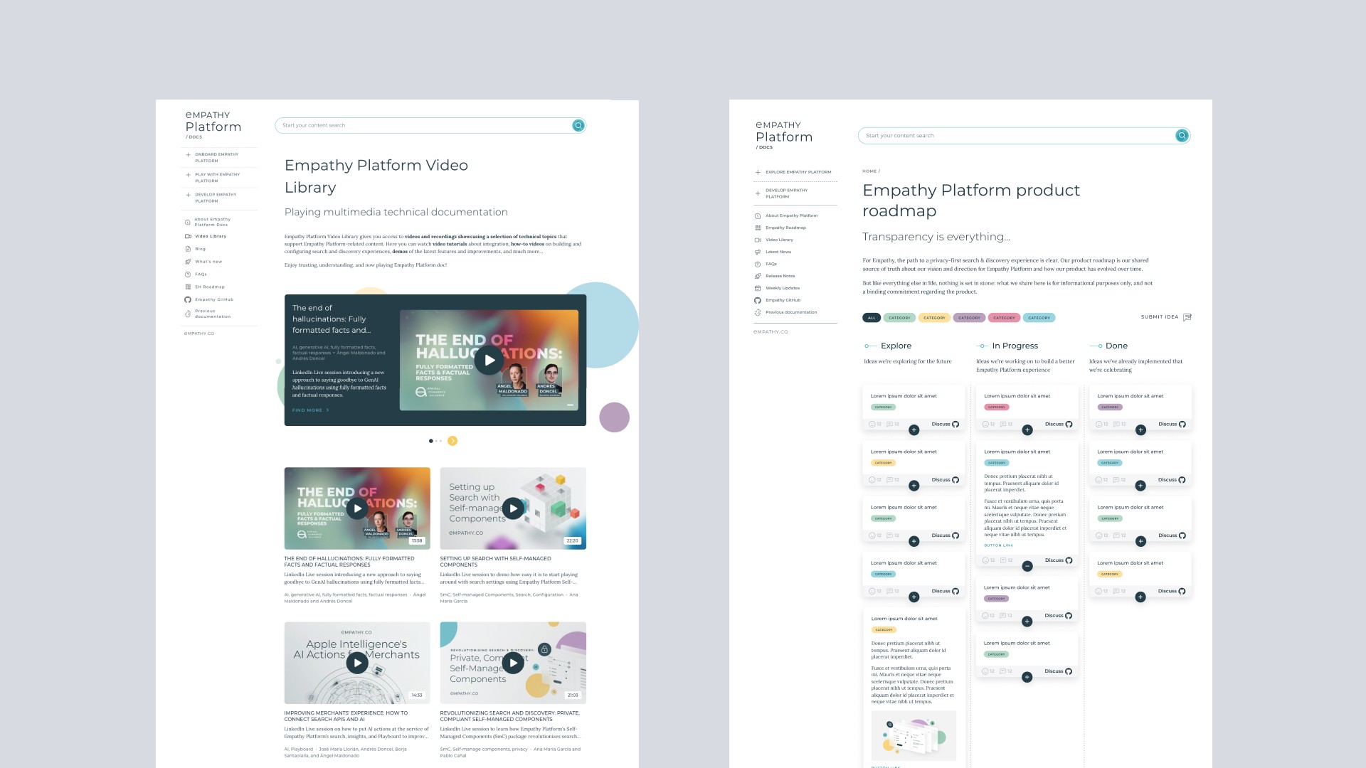
Information Architecture & Experience Design
Helped structure the documentation around real user needs and tasks, rather than internal product silos, making it easier for different profiles to understand where to start.
Designed a scalable navigation model and menu structure optimised for a dense documentation site, so users can move across sections without losing context.
Created a hybrid search experience that combines conversational, intent-based entry points with a more traditional document search and filtered browsing, improving content discoverability for both new and expert users.
Defined clear text hierarchy and page layouts to support quick scanning first and deeper reading when needed.
Applied WCAG-aligned accessibility improvements to colour, contrast and information hierarchy to make the portal more inclusive and easier to read.
UI and Visual Design
Using Empathy’s brand identity as the visual foundation, I created a documentation-oriented interface that feels consistent, recognisable, and aligned with the product ecosystem.
From that base, I defined a cohesive UI component library (navigation patterns, content blocks, cards, code elements, tags, callouts and form elements ) ensuring visual unity across the entire site and reducing variability en la producción de nuevas páginas.
I also designed smooth micro-interactions to support feedback, orientation and system responsiveness, giving the interface a more human and fluent feel without over-styling complexity.
In addition to the UI system, I created illustrations and visual assets specifically tailored for the docs, helping break visual monotony, guide attention and reinforce comprehension of technical concepts.
Collaboration & Process
Collaboration in a cross-functional team with developers, technical writers, scrum masters, product owners and product managers. Each role had a clear ownership in their area, enabling fast iteration and shared accountability.
Actively participation in team rituals, bi-weekly sprint reviews, design validation sessions, backlog refinements and technical alignment meetings with the development team. I regularly presented design proposals, collected feedback, defended UX decisions and contributed to prioritisation discussions to balance tech feasibility with user experience.
Design workflow driven through Figma, Jira, Confluence, ensuring traceability from concept to release. Taking care of dev handoff, reducing ambiguity.
Solution & Impact
The result was a fully redesigned documentation platform: modern, intuitive, and scalable that turned a static knowledge base into an evolving product experience. Here some key outcomes:
Improved user satisfaction and engagement, as reflected in internal feedback and public recognition.
Significant reduction in support requests thanks to a stronger self-service experience.
Winners at the DevPortal Awards (2022 & 2024) in the Best Visual Design and Content category.
Established a design foundation for future integrations with AI-driven features and content personalization.